









I’m proud to say that I think the full-feature turned out even better than the cover image! From a file-structure standpoint I really forged new terrain, and went crazy using adjustment layers on layer-groups choc-full of nested & masked layer-groups. I wanted to maintain maximum editability at all times. Basically a bunch of techniques nobody will ever see (that I should have been doing years ago), but I feel like I opened up some new workflows, and tapped a li’l further into Photoshop’s abilities as a compositing tool.

I totally got lost in my work while wrenching on this cover piece for S3 Magazine. Before I knew it, I had clocked over 13 hours and several revisions – specifically to the type in the main heading. I tried a few new things that really worked out well. I’m definitely excited to see this in-print!Stay tuned for the entire 6-page feature on Ameen’s car!

I had a chance to design an AWESOME shirt for Drift Alliance. The idea was to make a throwback ‘tour’ shirt that showed everywhere that drifting has taken them. Tony ran this idea by me in passing… and it was just too amazing not to be made. For those of you unfamiliar with Judas Priest… it is a tribute to their ‘British Steel’ record cover.
I’m super-excited how the design came out. It was a lot of fun to work on, and I learned a few new tricks to make vintage-looking graphics. I can’t WAIT to see these pressed up!


I had a great opportunity to design Ryan Tuerck’s hero card for Gardella Racing. In addition to the card, I was also tasked with redesigning the Gardella Racing logo. Overall I am pretty stoked with the result!
I would definitely love to wrench on more projects like these… so any of you FD teams in need… HOLLER.
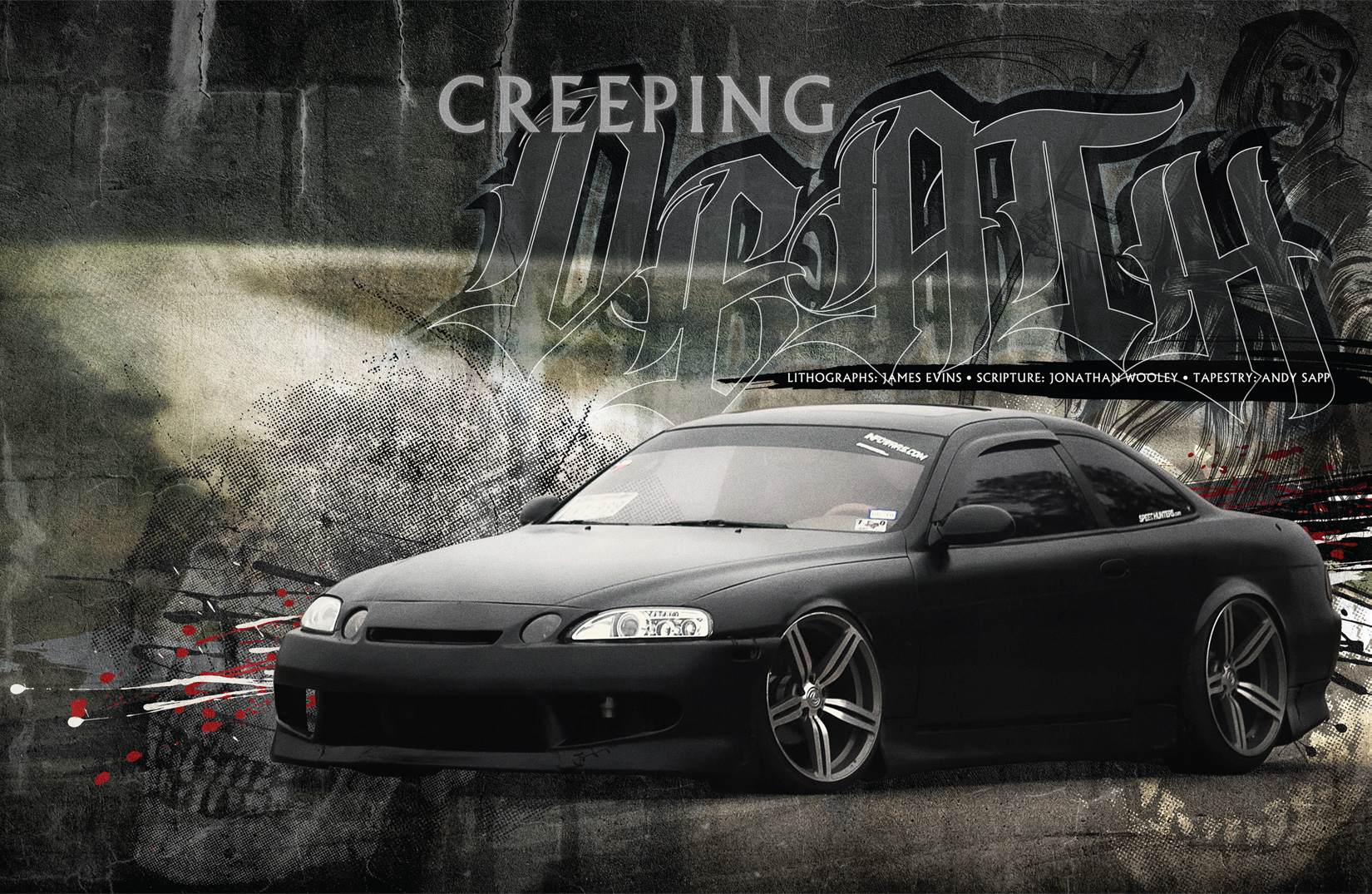
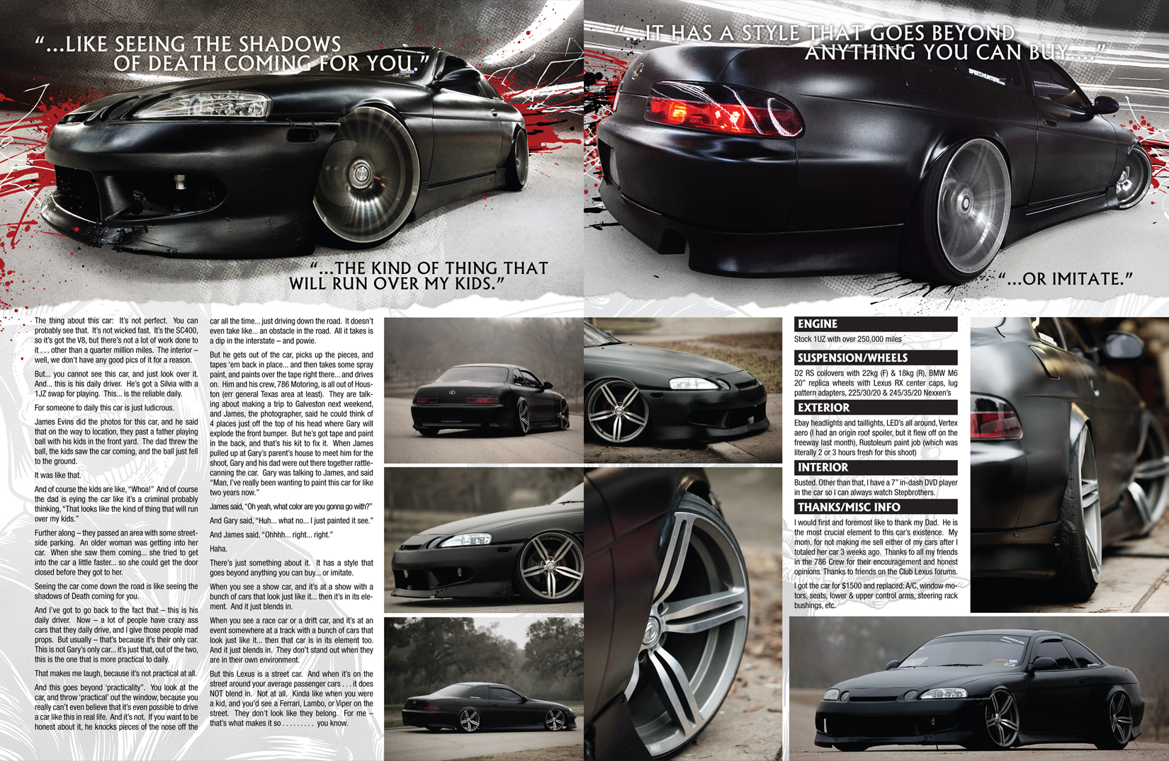
I just finished up a four-page piece for S3 Magazine. This gully SC400 just screamed heavy metal to me, so I went for a darker approach. Within the article, Wooley mentions how people are afraid of it, and seeing it drive down the street is like seeing the shadows of death… so “Creeping Death” seemed all-too-fitting for the title. The second two pages are not actually a double-truck, they are separated by full-page ads. I’m still on the fence about the overall layout. I like it, but I don’t love it. I guess time-crunches can do that sometimes.
Regardless, it was definitely a fun bit to put together!
A quick design I made for a short-run of eight-page flyers. These thank you cards will go out with every Slide Style™ order.
 Unfortunately, I couldn’t make it out to SEMA this year, so I threw a quick business card design together for Antonio since he would be in Vegas for the show. I utilized the same concrete projection technique I used for the Motorsport Nationals collateral, and I think it turned out pretty slick.
 rn
rn
The shirt I designed for our demo at the Motorsport Nationals. When it wasn’t pouring insane amounts of rain, we sold a lot of these tees. If only we had the insight to make raincoats. :P
If you’re interested in picking one up, they’re available over at Slide Style™.
I had the opportunity to design all of the ‘Hero Cards’ for the Motorsport Nationals autograph sessions. I put a lot of time into these cards, and wanted them all to be slightly different… while maintaining a cohesive feel that I developed for the flyer. Like the flyer, I wanted the design to feel vibrant with energy to help reflect the chaotic nature of the sport.


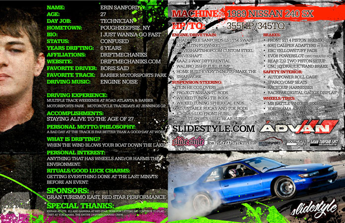


Big thanks to Cody for taking the profile pictures, and to Panda and Alex for coming through with action shots of the cars!

We will be down at Atlanta Motor Speedway this weekend for a drift demolition at the Motorsport Nationals. If you’re in or around the Atlanta-area… come on out and watch us destroy our Yokohama ADVAN Tires!I had the honour of wrenching on most of the print-collateral for the drifting portion of this event, and I think it turned out killer! I wanted the flyer to be packed with energy, and be something nobody in their right mind would throw away.