

Back in November at Artistic Image, I was tasked with creating an animated book trailer for Thinking Small by Andrea Hiott about the history of the Volkswagen Beetle. Armed with photos from the book and a script… I tried to come up with a look that was remnant of the classic VW ad campaigns by DDB, while trying to take the viewer on a journey through some the history behind the car. I enjoyed utilizing some typographic muscle to try and pull all the moments together with a cohesive look by using various weights of the Volkswagen typeface.This project was right up my alley in so many ways… and was a lot of fun to work on! I learned so much about Volkswagen’s history in the process, and can’t wait to read the book!
For Christmas this year I decided to make wood signs for the family lake house. The roads to get to the house are narrow enough to fit one car, and you have to make several turns down these roads to eventually get to the house. I think this is probably standard lake protocol… so that is essentially what I set out to do.It had been a while since I had done anything artistic that didn’t involve a computer… and while a computer was used in the process… for the most part – it was pretty hands on, leaving me smelling like burnt wood and sawdust. These aren’t completely done… but I’m at a good stopping point so I thought I would share.First thing… I set the type and set up some separations to cut some vinyl.


![]()
This is a roster representing some of the better logos I have designed over the years. Logo design was one of the main reasons I got into advertising/graphic design in the first place. I love the idea of a single graphic element capable of encompassing so much meaning, and leading the charge in overall representation to the public. In a world saturated with advertising and marketing, a logo can make or break you. My job is to make sure the latter never stands a chance.

I rolled up my sleeves and got to designing some new decks that are up in the Slide Style™ Deck Store… some of which I am really proud of.Don’t forget about the BIG F’N SALE going on until the end of the week! Prices have never been so low, so get it before it is GONE.


I’m proud to say that I think the full-feature turned out even better than the cover image! From a file-structure standpoint I really forged new terrain, and went crazy using adjustment layers on layer-groups choc-full of nested & masked layer-groups. I wanted to maintain maximum editability at all times. Basically a bunch of techniques nobody will ever see (that I should have been doing years ago), but I feel like I opened up some new workflows, and tapped a li’l further into Photoshop’s abilities as a compositing tool.

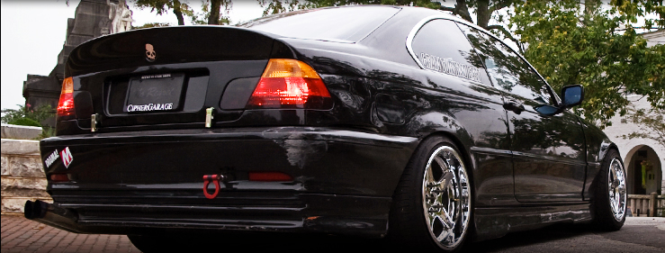
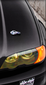
I totally got lost in my work while wrenching on this cover piece for S3 Magazine. Before I knew it, I had clocked over 13 hours and several revisions – specifically to the type in the main heading. I tried a few new things that really worked out well. I’m definitely excited to see this in-print!Stay tuned for the entire 6-page feature on Ameen’s car!

I had the pleasure of designing some t-shirts for Gardella Racing. The first tee was a ‘signature’ tee for Ryan Tuerck.

The second tee was specific to Gardella Racing utilizing the logo that I created for them. I think both of these turned out awesome! I’m definitely stoked to be working with Gary and his team! Keep an eye out for more rad stuff from the Gardella camp in the near future!


I had a chance to design an AWESOME shirt for Drift Alliance. The idea was to make a throwback ‘tour’ shirt that showed everywhere that drifting has taken them. Tony ran this idea by me in passing… and it was just too amazing not to be made. For those of you unfamiliar with Judas Priest… it is a tribute to their ‘British Steel’ record cover.
I’m super-excited how the design came out. It was a lot of fun to work on, and I learned a few new tricks to make vintage-looking graphics. I can’t WAIT to see these pressed up!


I had a great opportunity to design Ryan Tuerck’s hero card for Gardella Racing. In addition to the card, I was also tasked with redesigning the Gardella Racing logo. Overall I am pretty stoked with the result!
I would definitely love to wrench on more projects like these… so any of you FD teams in need… HOLLER.


I just finished up a four-page piece for S3 Magazine. This gully SC400 just screamed heavy metal to me, so I went for a darker approach. Within the article, Wooley mentions how people are afraid of it, and seeing it drive down the street is like seeing the shadows of death… so “Creeping Death” seemed all-too-fitting for the title. The second two pages are not actually a double-truck, they are separated by full-page ads. I’m still on the fence about the overall layout. I like it, but I don’t love it. I guess time-crunches can do that sometimes.
Regardless, it was definitely a fun bit to put together!


