


I’m proud to say that I think the full-feature turned out even better than the cover image! From a file-structure standpoint I really forged new terrain, and went crazy using adjustment layers on layer-groups choc-full of nested & masked layer-groups. I wanted to maintain maximum editability at all times. Basically a bunch of techniques nobody will ever see (that I should have been doing years ago), but I feel like I opened up some new workflows, and tapped a li’l further into Photoshop’s abilities as a compositing tool.

I totally got lost in my work while wrenching on this cover piece for S3 Magazine. Before I knew it, I had clocked over 13 hours and several revisions – specifically to the type in the main heading. I tried a few new things that really worked out well. I’m definitely excited to see this in-print!Stay tuned for the entire 6-page feature on Ameen’s car!

I had a chance to design an AWESOME shirt for Drift Alliance. The idea was to make a throwback ‘tour’ shirt that showed everywhere that drifting has taken them. Tony ran this idea by me in passing… and it was just too amazing not to be made. For those of you unfamiliar with Judas Priest… it is a tribute to their ‘British Steel’ record cover.
I’m super-excited how the design came out. It was a lot of fun to work on, and I learned a few new tricks to make vintage-looking graphics. I can’t WAIT to see these pressed up!


I designed this poster going for more of a SWAT feel than last years poster design. The photo I had to work with was cluttered with noise from low-light shooting, so it took a lot of retouching to make it look decent. I can definitely see this as a movie cover on the shelf at Blockbuster.
Unfortunately… this poster design fell victim to the chopping block, and got veto’d for print.
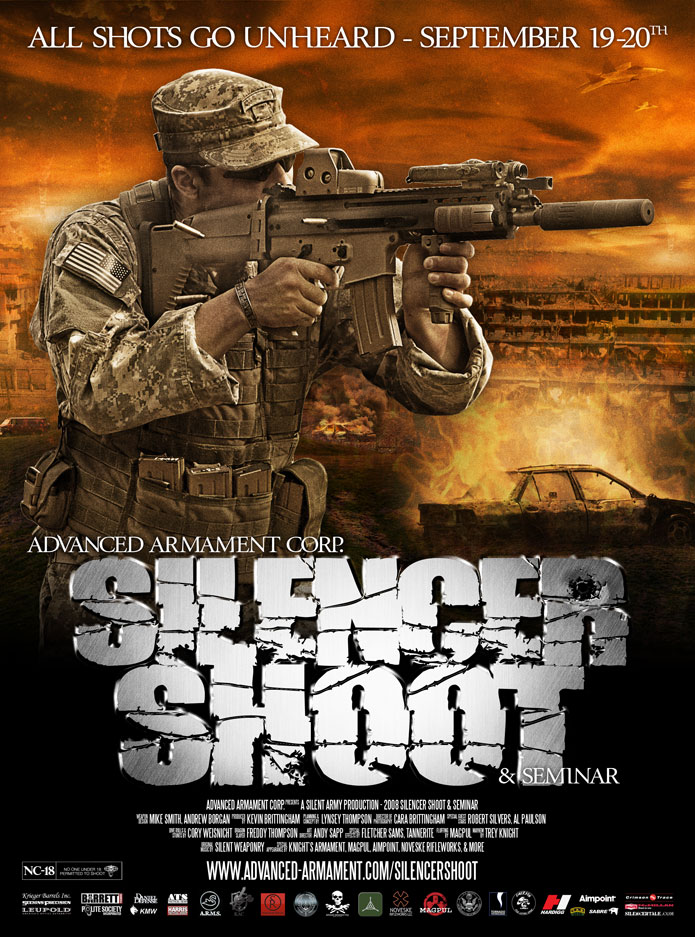
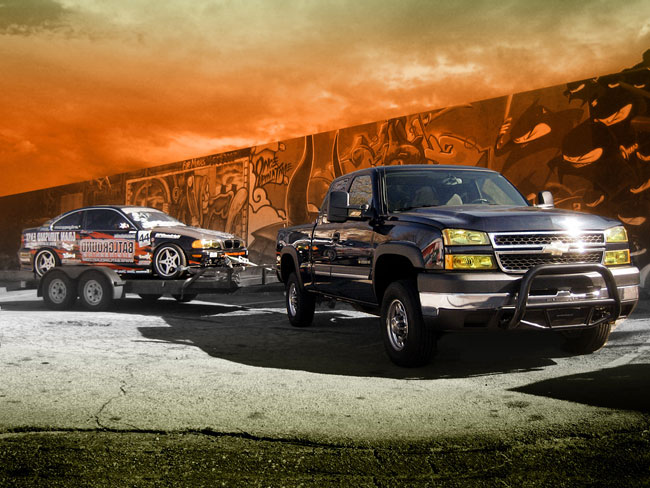
I put together a killer full-page advertisement for Advanced Armament Corp. AAC holds a yearly silencer-only shoot… encouraging other manufacturers, enthusiasts, and novices to come out and learn/share/experience the benefits of supressed shooting. The concept behind this advertisement was to make the shoot epic and unforgettable. Movie posters (when done right) are both… leaving you with the initial and lasting impressions. I used a wide variety of images in the final composite… including several images of cars on fire from last years shoot, destroyed Iraq, and more.
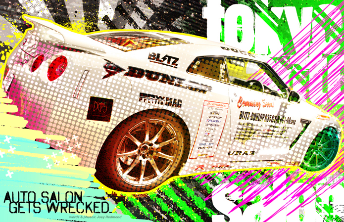
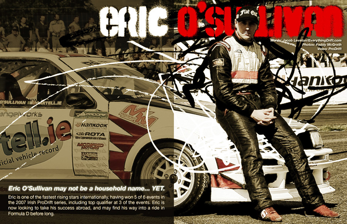
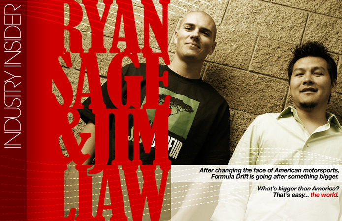
Design-wise, I stepped way out of my comfort-zone (in several ways) with the 3rd issue of Wrecked Magazine. These three spreads illustrate some of the different typographic, illustrative, and layout styles I put into the latest issue..
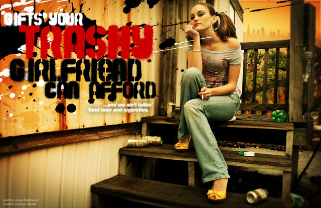
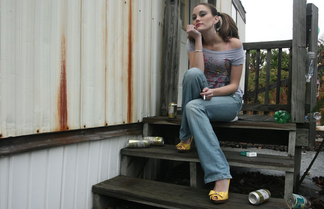
I managed to swing a nice retouch for the “Gifts Your Trashy Girlfriend Can Afford” spread in the 2nd issue of Wrecked Magazine:
The original photo by Joey Redmond:
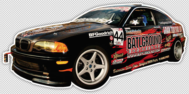
Not only did the guys at S3 Magazine allow my car to grace their cover… they handed the layout and retouch task off to me. Overall, I’m very pleased with the result! Big thanks to Dosa Kim for the sick firebird illustration on the hood! And to Carlos Richard for the photo for the cover!!

The original photo:

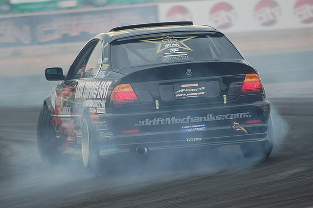
I spent a few minutes on a retouch of a great photo from Formula Drift Atlanta last weekend.
If you’re the photographer who took this… please e-mail me – I want to give credit where credit is due. :)
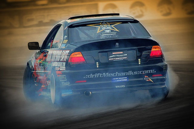
The original:
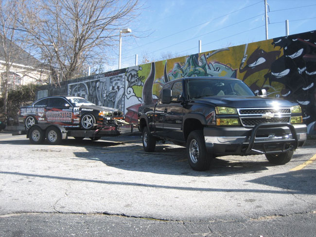
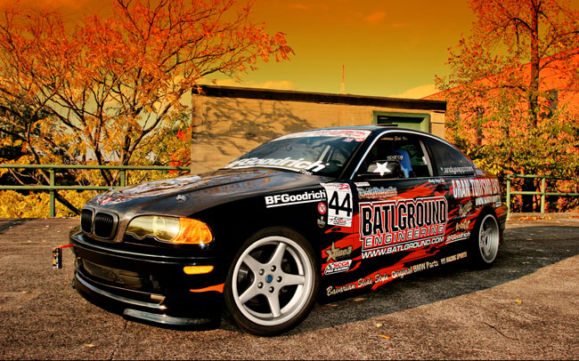
Some new techniques I’ve been messing with on a picture I shot of the rig all suited up with battle armor. What started out as a simple retouch, turned into a nice composite!
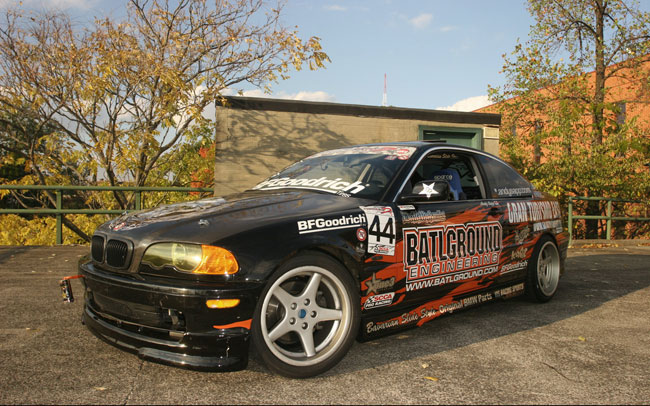
The original photo:
What started out as a simple retouch for a sticker, turned into an all out Photoshop-a-thon. It was kinda cool applying some of the techniques I learned through doing retouching for Vanity Fair at work.
Thanks to Joey Redmond, for snapping the original photo.
This is going to be the sticker that will double as my new business card.
(Screen captured from CMYK):